
Pan Am Airlines
Introduction
Role
UX/UI Designer and Researcher
Duration
4 weeks
Tools
Figma
Background
This projects is based on the hypothetical situation of Pan Am Airlines, who ceased operations in 1991, wishes to rebrand and make a comeback in the modern market. They plan on launching a new airline in 12-18 months and are looking for a streamlined, well-thought-out user experience to match. 2016 was projected to be the first year where more than half of all online bookings for U.S. travelers will be completed on a device or tablet. Although an app is in the long-term roadmap, it’s not the first focus at the moment. Instead, Pan Am wants to start with a responsive site that doesn’t force users to download and install anything.
Project Objectives
Develop an updated and modern brand identity
Create a responsive website
Design brand logo and high fidelity prototype
Research
Research Goals
For the most part, airline websites tend to follow a similar pattern that user’s have grow familiar with. Through this research, I wanted to understand the slight variations and features that airlines incorporate that user’s find useful during their hunt for flights. I also aimed to find what users find frustrating or confusing on airline websites, so that I can avoid these points when designing for Pan Am.
Competitive Analysis
By observing preexisting online retailers we were able to find trends strengths, weaknesses, and commonalities as well as gauge the market and potential competitors. Though different airlines has slight variations in features, this analysis made it clear that there is a general format that most airlines follow in their layout. This point made me realize that deviating too drastically from this format can possibly be a problem in terms of familiarity and learnability for potential users.




Strengths
Clear display that differentiates lowest fare .
Keeping the flight information display simple minimizes clutter.
Weaknesses
Poor hierarchy makes Departure and Return pages hard to differentiate.
No progress bar during booking procedure.
Lacking a efficient way to return to previous pages during booking process.
1-on-1 Interviews
The purpose of these interviews was to discover different opinions, needs, wants, and priorities towards their online booking and check-in experiences for air travel. By having individuals of different backgrounds and preferences, we are able to better gauge what to aim for and avoid for Pan Am’s comeback website.
Interviews: 4
Duration: 15- 20 minutes
Age Range: 24 - 30
Occupation: Varying
Findings
100% of the interviewees prefers to use Expedia or Google Flights to compare cheapest flight prices between multiple airlines.
100% find the most important feature to revolve around a clear presentation of flight prices.
50% put emphasis on filters and sorting based on price.
50% found a visual indicator of the cheapest prices based on the combination of departing/return dates to be most helpful.
In average all interviewees traveled between 2 to 4 times a year.
All interviewees have not traveled this year due to the pandemic.
75% sign up for notifications for updates regarding their flight.
25% marks the date/time on their own calendar and checks for flight status on their own.
50% purchase their flight tickets directly from the airline rather than booking services like Expedia or Google Flights.
One interviewee stated this is due to a sense of security buying directly from the airline instead of a third party.
Takeaways
Through the interviews, it was clear that filtering flights and budget is a strong priority for users when trying to book a flight. With that point I need to make as easy as possible to find the cheapest flight and have robust filter and sorting options to organize the large amount of flights and information that will be on the screen at once. For more flexible users, I would need to display the cheapest price of the day in the date selection process for the users to find the best budget departure and return dates. The interviews also brought up the need for a clear option for notifications for flight updates during the booking procedure.
Define
User Persona
By observing common patterns from the User Interviews, I created Robert as a persona to represent the “average” user that can be used as a point of reference throughout the project. Robert serves as a singular reference point for the needs and pain points that I find to be common, not only from the interviews but for people you may know or even yourself. The aim was to establish Robert as someone that you have in your friend group or someone you know from your peers.
Empathy Map
To further understand the potential users and establish a human-centered mindset, a Empathy Map was created. The persona serves as a general fact sheet of who Robert is, but by looking at life through his lens, you can truly empathize with him or even see a little of yourself in Robert.
Sitemap
Assessing the needs and frustrations from the interviews as well as common trends and strengths from the competitive analysis, I created a sitemap to organize the pages and navigation that will be necessary. Though all these pages are not reflected in this current prototype, by having this sitemap, it allowed me to organize my thoughts on what information should be present in certain pages and sections of the website. Airline websites cover a large amount of information which can be overwhelming to the users and clutter the interface. This sitemap helps view the website as a whole to allocate the different purposes of each page to avoid redundancies.
Design
Low Fidelity Wireframes
Using notes from the User Interviews and the Competitive Analysis, I created a low fidelity wireframe that follows a familiar layout to maintain learnability and avoid usability issues. A key point was to fit a large amount of information on the page while keeping the visual aesthetics simple to avoid overwhelming the user. To accommodate users like Robert, I explored ways to make the lowest fares easier to spot.
Other than making the cheapest flight easy to find, one of the important features I wanted to include was an interactive progress bar to make it clear to the users where they are in the booking procedure. Many competitors did not have a progress bar and relied on a back button to cycle through previous pages to change any information.
Responsive Wireframe
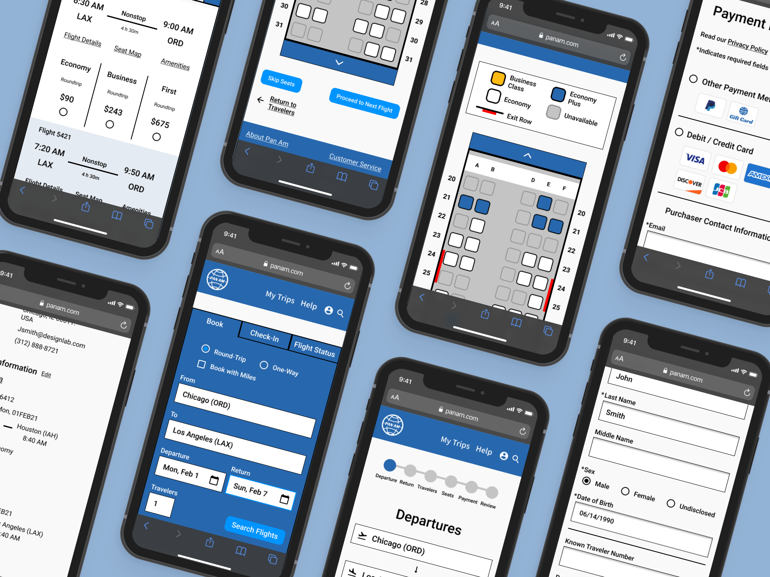
To address Pan Am’s goals to have a modern website that works for a wide range of screen sizes without making a mobile app, I created the mobile wireframe with the constraints of a more narrow screen with a emphasis on vertical scrolling. While creating this design, considerations of accessibility such as font size, contrast, and thumb zones were a main driving force in the changes from the desktop version. Some notable changes were extending the input fields to be the full width of the screen and putting high priority buttons and fields in the natural thumb zone.
Adjusting to the smaller screen size, the Departure and Return pages had to be slightly reformatted to avoid overcrowding the screen and overwhelming the user. The challenge was to keep a consistent style and feel to the desktop version while changing the interface to fit the mobile screen.
Logo Design
The challenge for branding and making a modern version of Pan Am’s logo was to keep the overall feel of the very recognizable original logo while creating an updated modern design.
The globe with the Pan Am name centered as well as the color palette were kept consistent to the original logo
To give a more minimal feel the amount of lines on the globe were reduced but made thicker.
The typeface was updated to a angular Sans-Serif to give a more modern feel.
The italicized font also gives a sense of movement, appropriate for an airline logo.
The original Pan Am logo
Modernized logo
UI Kit
Prototype
High Fidelity Wireframe
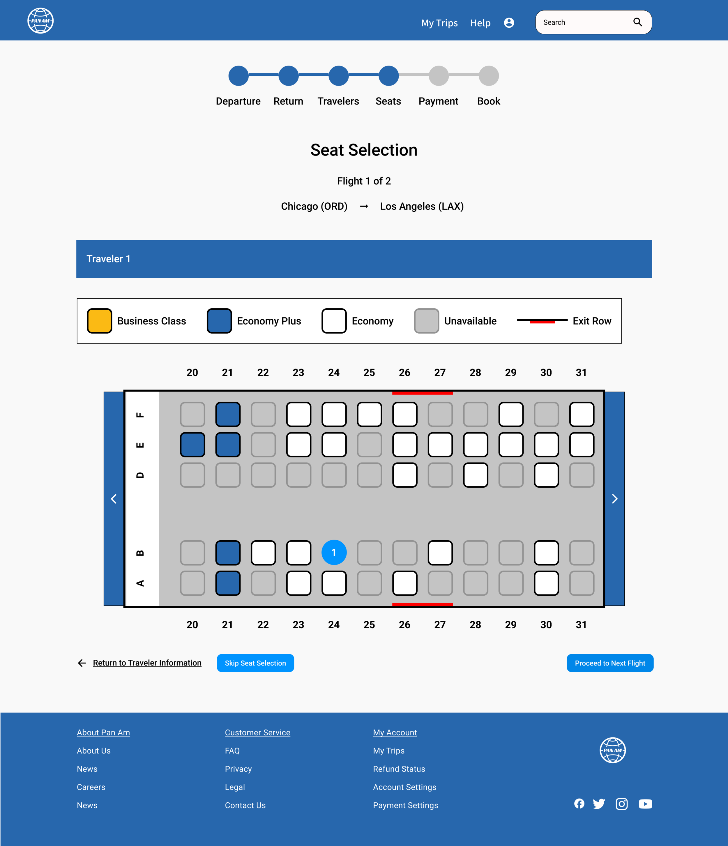
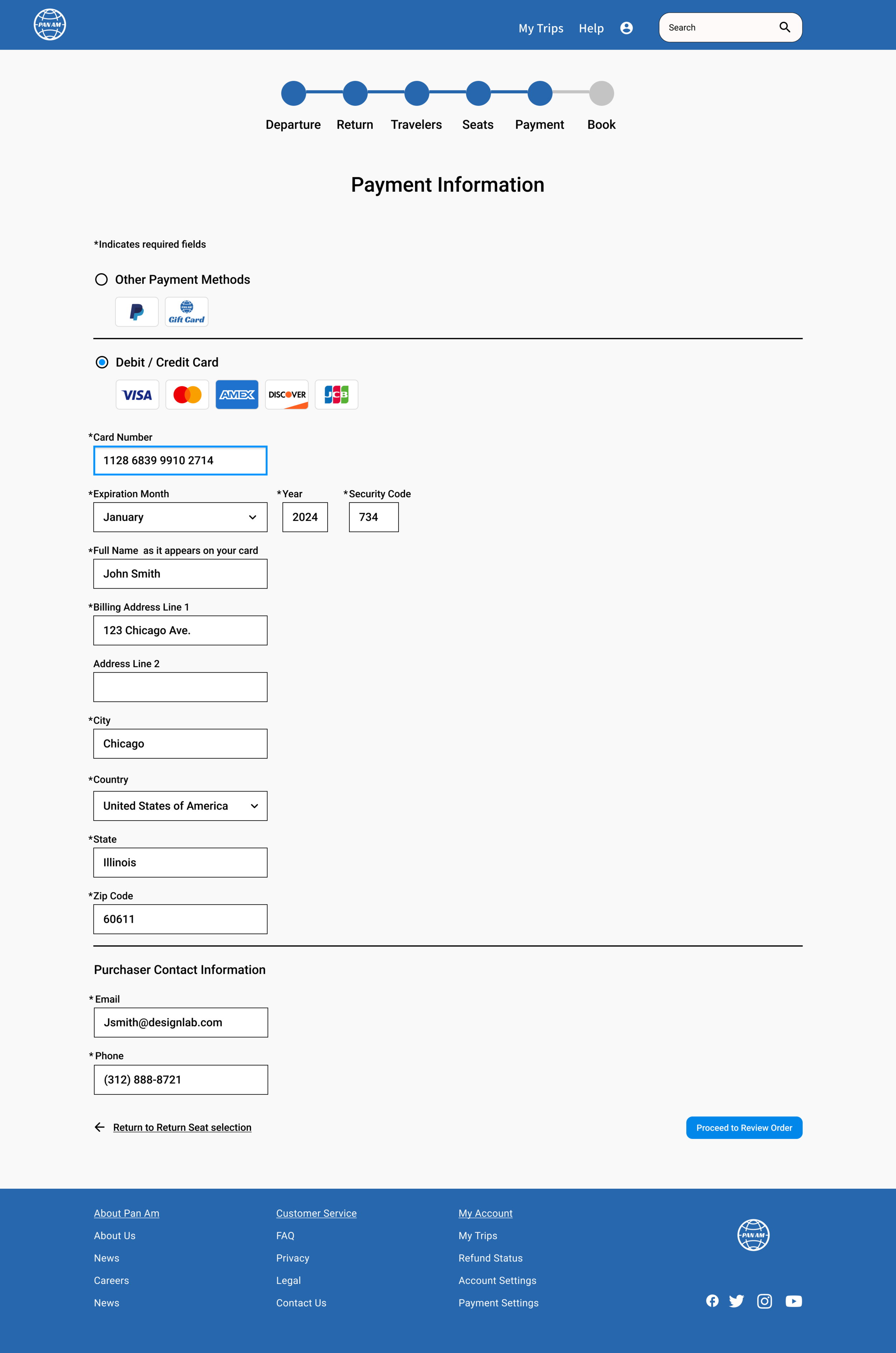
Compiling the research, low fidelity wireframe and sitemap, I created a high fidelity wireframe to be used for the prototype. To stay consistent with the branding the primary colors used throughout the site are different shades of the Pan Am blue. The use of colorful images was limited to the front pages where the users can explore different possibilities for their travels. Once the user enters their flight booking flow, I wanted to keep the page minimal to balance the large number of information that the users need to navigate through to find the right flight for their needs.






Usability Test
In order to test the effectiveness of the navigation, intuitiveness of the UI, and discover potential pain points, a remote usability testing via screen share was conducted using the Mobile Prototype.
The participants were asked to complete 2 tasks under 2 scenarios.
You come to the Pan Am website wishing to book a flight from Chicago to Los Angeles on a budget.
- Book a flight from Chicago to Los Angeles choosing the lowest fares.
When reviewing your itinerary you decide that you want to avoid layovers, even if it costs a little more.
- Return to Departure flights, filter the search results to only nonstop flights, and select the cheapest nonstop departure flight.
Affinity Map
The usability test had a 100% completion rate with minimal friction and pain point due to the familiar navigation design.
Using a affinity map, I organized the major findings from observing and interviewing the participants from the usability test.
Reflection
The Pam Am project made me reflect on the different approach that is necessary for a corporate website vs an very stylized ecommerce or fashion website. In comparison to the MIRROR project, there is a lot more information that needs to be packaged in a simple and minimal matter to avoid clutter and overwhelming the user. The difficult task for this project was finding an efficient way to improve comprehension of the users and the overall information architecture. Designing this website made me realize the completely different approaches necessary for different users and clients as well as the importance of adjusting to different screen sizes and utilizing the differences between devices.
Next Steps
Continue to make iterations to the website to better serve the users.
Usability test reiterations to gauge the effectiveness of the changes.
Hand off design specifications to developers.