
MIRROR
Introduction
Role
UX/UI Designer and Researcher
Duration
9 weeks
Tools
Figma
Adobe Illustrator
Background
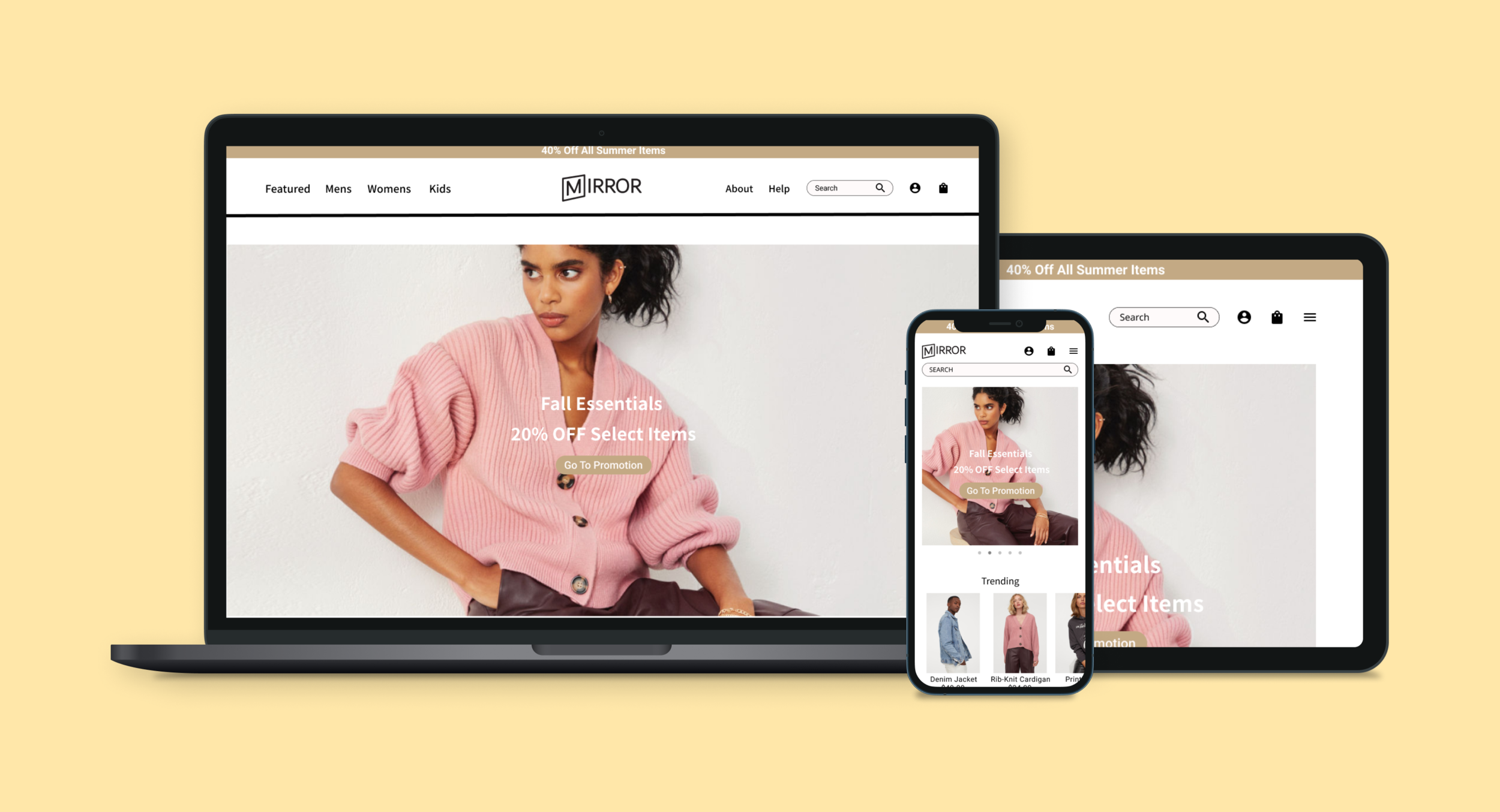
Mirror is an fictional clothing retailer that wishes to open an online store to be able to sell all their products for different people and styles. Customers have been requesting an online platform for years, citing its convenience. Mirror started back in 1994 as a clothing store targeting an audience looking for cheap clothing for any occasion, with over 400 offline stores around the world in 32 countries.
Project Objectives
Develop MIRROR’s brand identity
Create a responsive e-commerce website
Design brand logo and high fidelity prototype
Research
Research Goals
Through this research, I primarily wanted to gain a better understanding of what users like or dislike while shopping for clothes online. With so many different online clothing retailers competing with similar interfaces, I wanted to get a better gauge of what features add value to the users’ experience and where they fall short. Given the context of MIRROR being a physical store branching out to online retail, it was also important to me to define the problems that physical stores have that online shopping can solve. Being a new online presence, coming into a very established market, I wanted to understand the current environment of online retailers as well as companies that will be top competitors that users will be comparing MIRROR to.
Competitive Analysis
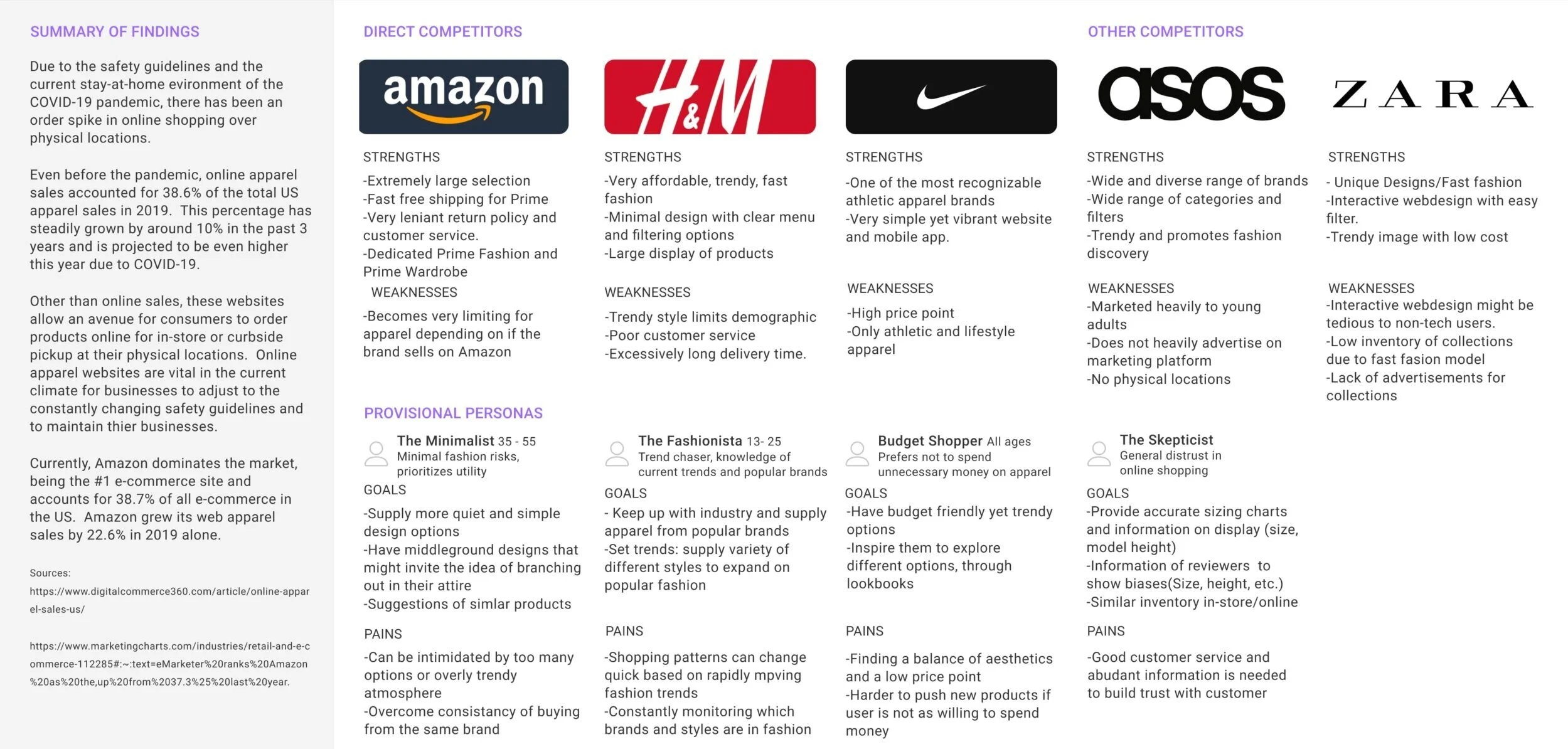
By observing preexisting online retailers I was able to find trends strengths, weaknesses, and commonalities as well as gauge the market and potential competitors. Through this research, I was able to deeply observe how different online retailers organize their vast inventory to help users browse for clothes without being overwhelmed. Comparing these major retailers also brought to attention on how they target certain audiences through their branding with their stylistic choices and imagery.
1-on-1 Interviews
I conducted 3, 30-minute interviews with individuals that are ranging from 25 to 30 years old, with varying occupations, in different field.
The purpose of these interviews were to discover different opinions, needs, wants, and priorities towards their online clothes shopping experience. By having individuals of different backgrounds, shopping styles, and preferences we are able to better gauge what to aim for and avoid for MIRROR’s transition to the online platform.
User Goals
Find clothes that fit the way they want without physically trying on the product.
Discover new inspirations in outfits or ways to style the product they wish to purchase.
Easily find the desired clothes on the site with ease.
User Needs
Features to suggest if the product will fit the way they want.
Variety in models to help envision how they clothes will look like on them.
Well defined categories and filters to narrow their search.
Organized and simple display of products to avoid being overwhelmed with too many options at once.
Have clear indication if the item is in stock.
User Frustration
Proper sizing is hard to determine without trying the product on.
It is tedious to return items.
Sponsored items do not reflect what they want.
Not enough diversity in models showcasing the clothes.
Not enough pictures or descriptions on the item to make an informed purchase.
No context or information about reviewers to gauge if the review is relevant to customer.
User Motivations
Shopping from the convenience of home
Larger inventory of clothes online
Better organized inventory than in stores
No pressure from other shoppers, staff, or the limitation of being in the store
Frequent promotions
Can browse and compare multiple stores at once.
Define
User Persona
Based on the information from the primary and secondary research, I developed a persona that reflects a potential user for the product that can be a point of empathy through out the project. Through the 1-on-1 interviews, it became clear that the biggest disadvantage of buying clothes online is the inability to physically try on the clothes and the fear of buying ill fitting clothes. This helped craft a persona that realistically reflects the frustrations and pain points of many users that need clear information regarding size and fit to make a informed purchase. This major pain point gave me direction in one of the features that needs to be clearly present and easy to use in my prototype.
Empathy Map
After making Zoey’s persona, I tried to think about what the world looks and feels like through her lens and summarized it into a empathy map for others to better relate and understand what kind of person Zoey is.
Card Sorting
An 30 card remote open card sorting was performed on 6 participants to find patterns and possible outliers in categories that can be used on the website.
Most of the participants grouped the card is quite consistent categories, but the biggest division came in how the participants categorized “tops.” Some categorized based on sleeve length while others differentiated between casual and dressy clothes.
You can find additional information from the card sorting, here https://bit.ly/2U2qweH
Sitemap
Utilizing the category trends from the card sorting as well as common navigation patterns found in popular ecommerce websites found during the competitive analysis, I created a sitemap for the potential navigation for the MIRROR website. For a site that will be curating a large inventory and information, this sitemap helped to organize my thoughts of how the navigation of the overall site will look like before creating any sort of wireframe.
User Flow
Based on the potential Sitemap, I explored potential user flows in order to consider efficiency as well as discovering potential friction points that users may encounter. This process gave me the opportunity to think of different navigation paths for users to use to accommodate for different user flows. The need for multiple navigation paths was clear to me from the observing other major retailers and their methods of navigation during the competitive analysis.
User flow for an user to visit the MIRROR website to purchase a men’s hoodie.
Design
Wireframe Sketches
Before creating wireframes, I quickly sketched out potential layouts in order to brainstorm that I can explore. The inspiration for these layouts came from observing major competitors from the competitive analysis and incorporating familiar patterns as well as my own layout. By doing so, it became clear that there are certain aspects of layouts that are consistent within multiple websites for users to have a sense of familiarity and better the learnability of the layout.
Wireframes
I proceeded to create a low fidelity wireframe by compiling navigation ideas based on the card sorting, sitemap, and common navigation patterns from major competitors. After doing the sketches, I decided that I wanted to keep the header minimal with simple navigation but have one large image on a carousel to catch the attention of potential users for the homepage. I also wanted to promote exploration for the users that while on the homepage by showcasing popular and new items as well as images from social media to see the products being worn. To bring attention to the banner on the top and for newsletter sign-up, I reserved a darker accent background for these parts and kept the rest of the site simple. Design choices such as having the major navigation categories, search, account, and shopping bag in the header or having the filters on the left column next to a grid layout of the products were made so brand new users can visit the website and still navigate throughout the site intuitively and feel a sense of comfort and familiarity.
Responsive Wireframe
After creating the low fidelity wireframe, I created a responsive wireframe to visualize MIRROR on different devices. Given the horizontal limitation of space in tablets and mobile compare to the desktop version, the navigation and account information have been condensed into a hamburger menu to avoid a cluttered header and maintain the minimalistic aesthetics. Additionally, for the mobile, being the most limited in horizontal space, I introduced a side scroll to avoid over crowding the screen with products.
Logo Design
For designing the logo for MIRROR, I took into consideration that MIRROR’s mission is to cast a wide net and be appealing and accessible to a wide demographic. Based on a minimal, modern, and trendy branding without appearing too up-scale to scare off more casual users, I made iterations to find a logo that will fill that mold.
Early logos and monograms, exploring different typefaces.
I decided to move forward with a softer San Serif font to give an accessible feel while keeping a lower weight to give the minimalistic feel. I also explored adding dimension to the monogram to make logo more memorable.
Final Iteration
Style Tile
Once the logo and the general direction of the branding was established, I created a style tile to organize the different elements and theme of the website, such as the color palette and typeface.
A primarily monochromatic color palette was chosen to emphasize the minimalistic feel. The tan/gold was chosen for accents to introduce some warmth to the site, while adding a feel of elegance. Another advantage of a monochromatic palette is that the pop of color will be coming from the product images, allowing the products to stand out from the white background.
For the typefaces, I chose a minimal Sans Serif font to stay consistent with the minimal feel and keep the focus for the website on the product images rather than a flashy font.
UI Kit
Prototype
High Fidelity Wireframe
Compiling the early wireframes, style tile, sitemap, and user flow I created a high fidelity wireframe to be used for the prototype. I made the prototype based on a common user flow of finding and adding a product to cart and finding out what size would be the best fit for the user. I also wanted to put focus on ease of navigation, so I made multiple paths a user can utilize through either the top navigation, its dropdown menu, or filtering on the category page.
Usability Test
In order to test the effectiveness of the navigation, intuitiveness of the UI, and discover potential pain points, a remote usability testing via screen share was conducted.
The participants were asked to complete 2 tasks under 2 scenarios.
You go on to MIRROR’s website to purchase a simple cotton t-shirt
- Add a Men’s, Small, Premium Cotton T-Shirt to your shopping bag.
While searching for the t-shirt, the denim jacket on the homepage caught your eye but you do not know what size you should purchase.
- Return to homepage
- Select the denim jacket
- Find out what size would be the best fit for you
- Add denim Jacket to shopping bag
- Confirm both t-shirt and denim jacket are in your shopping bag
Affinity Map
The usability test had a 100% completion rate with minimal friction and pain point due to the familiar navigation design found in many online clothing retail stores.
Using a affinity map, I organized the major findings from observing and interviewing the participants from the usability test.
Reflection
By working through this entire project, I’ve learned the importance of iterations and how each point of the process helps to cultivate the next. It was a vital opportunity to learn that the design process is not rigid and there will always be situation where it is necessary to go back to a previous step in order to reiterate. This project has taught me that UX design is a cycle of learning, empathizing, and adapting to the ever changing needs and problems of the users. Working on a retail site with a potentially large inventory of items also brought to attention the importance of efficient navigation throughout the site as well as having multiple paths to avoid frustration.
Next Steps
Continue to make iterations to the website to better serve the users.
Usability test reiterations to gauge the effectiveness of the changes.
Hand off design specifications to developers.