
COVID-19 Tool
Introduction
Role
UX/UI Designer and Researcher
Duration
4 weeks
Tools
Figma
Background
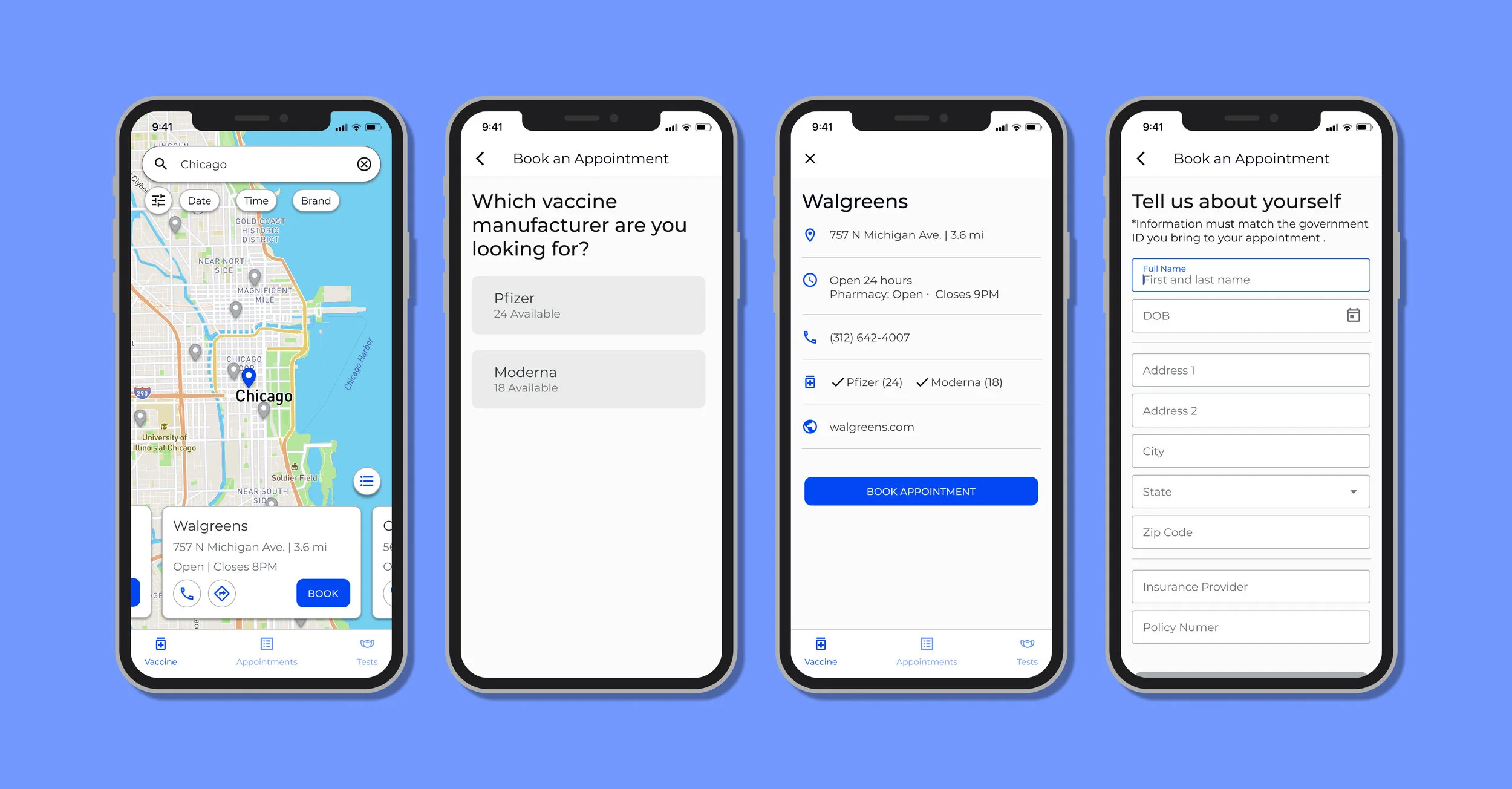
When the COVID-19 vaccine rolled out, the short supply and restriction on phases left everybody in a free-for-all scramble to get their hands on a vaccine. Regardless of the high demand, there is a lack of a centralized resource to easily find appointments for vaccines that fit the needs of the general public. This project explores the possibility of an application that allows users to conveniently find and book vaccine and test appointments with parameters that fit their needs, rather than painstakingly searching individual sites, one at a time.
Project Objectives
Create an end-to-end application that helps to frustrations and pain points of finding COVID-19 vaccination appointments.
Design a intuitive and familiar interface to minimize learning curves and increase usability for a wide age range.
Design a flow that allows users to search and book an appointment without having to leave the application.
Research
Research Goals
The primary information I wanted to gain from this research was to gauge out struggles and frustrations that potential users have faced while searching for COVID-19 vaccines. By better understanding what’s lacking in the current vaccine searching process, I can better cater the available features and functionalities to the app to better solve these problems.
Considering the fact that this is a new product with no major apps to use as reference, it was also important to analyze the strengths and weaknesses of apps that fulfill the major functionalities that this app will revolve around, mapping and booking. Getting a feel of what users want or expect when using search and book apps also gain direction to how to ideate the new COVID-19 app.
1-on-1 Interviews
The purpose of these interviews was to understand users’ pain points and needs while trying to find and book appointments for COVID-19 vaccines as well as pros/cons and behaviors of map/booking apps through the eyes of users.
Interviews: 4
Duration: 15- 20 minutes
Age Range: 26 - 35
Occupation: Varying
Findings
50% of the interviewees had a bad experience and the other 50% split between mediocre and positive.
50% had to check multiple sites to find an available appointment.
100% of the interviewees want to be able to see:
Brand of vaccine
Available time/date of appointments
50% wanted to see the number of vaccines is available.
One of the interviewees wanted to see information on required documentation for their appointment.
100% use Google Maps as their primary map app
All participants like the accessible information (i.e. address, hours, directions, website, contact information, photos)
All participants primarily like their booking apps for a clear visual representation of available time slots for making appointments.
Takeaways
Through the interviews I found that users found that finding available appointment times was a major frustration point in some form for all the participants. The participants made it clear that the app must have the information of the vaccination site and available time/date easily accessible. In order to address the struggles of finding the right appointment for the user, filters for vaccine type and time/date is a must. In terms of the interface, all participants are very familiar and favor the Google Maps UI/UX.
Ultimately, the interviews confirmed that some of the biggest struggles of finding a vaccine is the guess and check of different suppliers, hoping they have availabilities of the time and type of vaccine that users want. Hearing consistent struggles and experiences from the interviews definitely affirmed the merit of having some kind of centralized source to filter and find vaccination appointments.
Define
User Persona
Timmy is a relatable representation of the struggles and needs of many of us, particularly from the interviewees, who struggled to find vaccinations during this global pandemic. Considering the global impact of the pandemic Timmy is a relatable representation of the struggles that millions of people are facing around the world. Culminating the information gained during the interviews, Timmy was created to be a reference point of a potential user that can utilize this application to solve his problems.
Heuristic Analysis
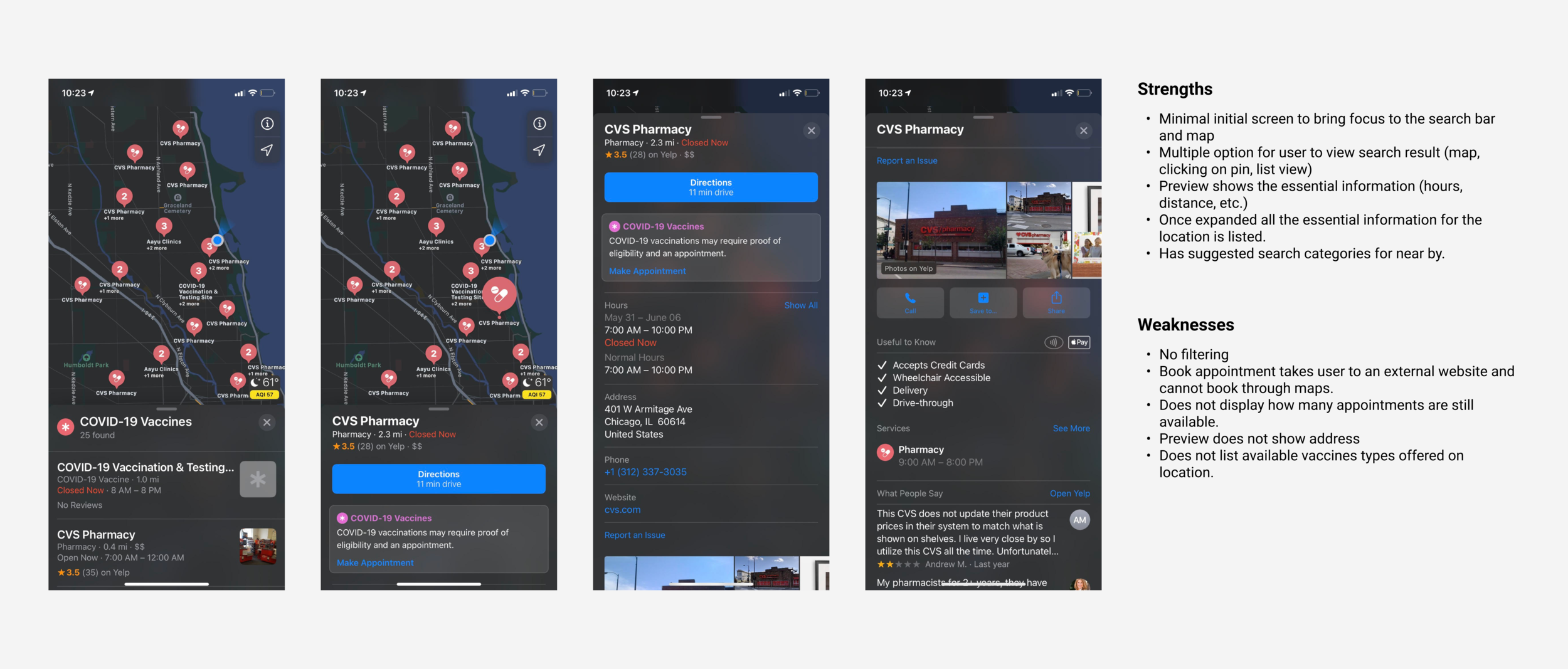
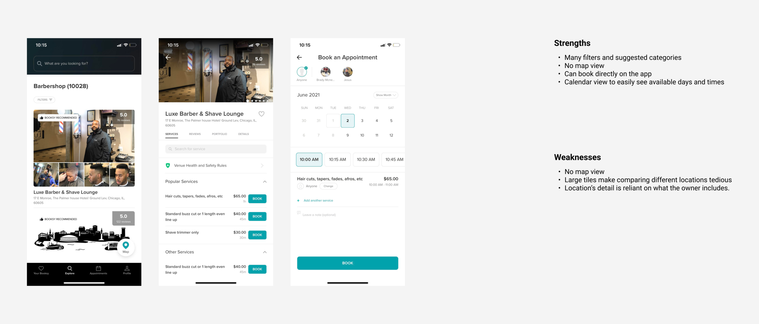
Given the nature of the application I needed to observe both map applications as well as booking applications. By observing the strengths and weaknesses of applications in both categories, helps me find features to integrate and flaws to avoid. These observations were also necessary to ideate how I can combine these features in one seamless flow.
I chose these application with the vision in mind of if users can go on these map applications that is specifically made for COVID-19 vaccine and test sites. As of now, these applications give some information related to vaccines, but users still have to leave the app to visit the vaccine site’s webpage to actually start the booking procedure.
Design Systems
Color Palette and Typeface
For the purpose of this medical application I prioritize simplicity and legibility to address the wide age range for potential users.
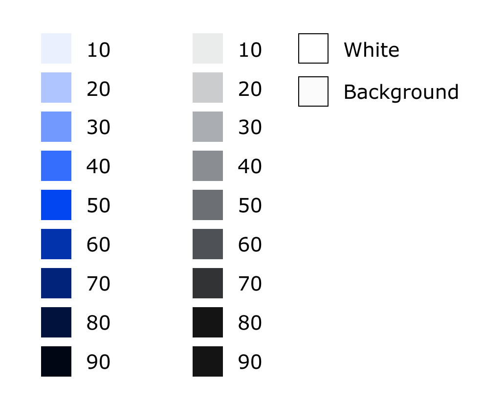
COLOR: A monochromatic blue color palette was used because cool colors are known to be calming/soothing and blue symbolizes “loyalty, strength, wisdom and trust”, being commonly used in the medical field.
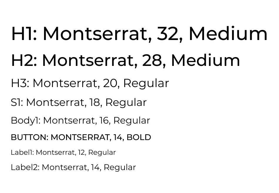
TYPEFACE: Montserrat was chosen based on the fact the medical field tends to lean towards legible Sans-Serif fonts, prioritizing accessibility over stylization.
Design System
In order to streamline and organize the assets used throughout the application, I created a design system organizing the components and their different variants and states. By creating the design system and putting focus into each component, it really emphasized the importance of considering all the different scenarios that these assets will be used. Though these assets are catered to the current prototype, it made it very clear that to make a design system that accommodates an entire application or website, there are many more variants that need to be considered.
Low Fidelity Wireframe
After creating the design system, I used whimsical to organize the assets and get a better visual of how the assets will be put together to create my desired flow.
My initial design had one page designated for the users to input their information, but after receiving feedback that it can feel messy and overwhelming, the inputs were spread out into steps on their own pages based on the topic of the information needed. From my viewpoint, looking at the entire design spread out in front of me, the additional pages initially felt like it might be more tedious for the users. But I came to the realization that from the users’ standpoint they would be looking at simple and straight forward pages one at a time with less time spent per page, minimizing confusion as well as less opportunities for errors.
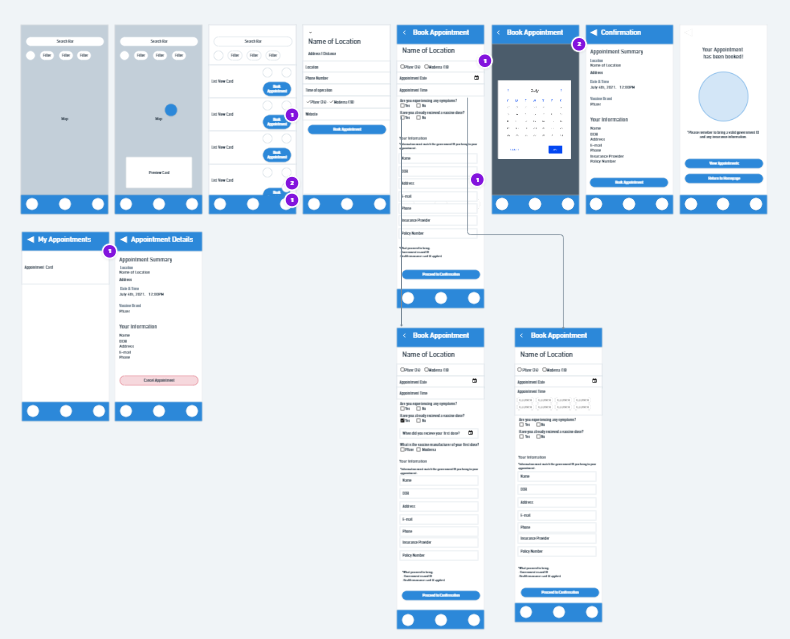
First iteration with all user input condensed in one page.
Second iteration with less clutter and inputs spread out into steps to create a less overwhelming and streamlined flow.
Prototype
High Fidelity Wireframe
Using what I learned from the low fidelity wireframe as well as the design system that I created, I pieced together my high fidelity wireframe.
Usability Test
In order to test the effectiveness of the navigation, intuitiveness of the UI, and discover potential pain points, a remote usability testing via screen share was conducted using the Mobile Prototype.
The participants were asked to complete 2 tasks under 2 scenarios.
You wish to find available vaccine appointments in Chicago for 7/4 between 5 – 11PM.
- Use the map and filters to find your options for locations that have appointments that fit your parameters.
Now that you know your options book your appointment at the Walgreens and confirm you successfully booked your appointment.
- Go through the booking procedure and confirm your appointment on the Appointments page.
Test Details
Interviews: 4
Duration: 15- 20 minutes
Age Range: 27 - 66
Occupation: Varying
Usability Test Findings
All 4 participants were completed the tasks with minimal pain points. The simplified booking procedure with each step broken up allowed the participants to complete the task without being overwhelmed or getting distracted from the intended flow
Navigation of the map and search function went smoothly due to the participants’ familiarity with using Google maps.
By observing the participants, it seems there is a slight hesitation and confusion on the confirmation screen caused by the fact that the button on the snackbar serves the same purpose as the “MY APPOINTMENT” button on the screen.
Given the temporary nature of the snackbar, some users may feel pressured to click it before fully exploring the information on the page.
High Priority Revision
To address the potential frustration or confusion that may be caused by the snackbar, I decided to keep the snack bar as just a notice of confirmation and use the button on the screen as the primary flow to the appointments page. This method better fits the temporary nature of the snackbar, giving the user the confirmation that they need and leaving the screen to let the user explore the page at their own comfortable pace.
I created a snackbar with out any buttons and made it a single line.
Reflection
Designing this application end-to-end truly emphasized the importance of looking at the design through the lens of the users and not getting lost in big picture that I see from the designing-end. Using tools like Figma Mirror and frequent visits to the prototype helped with this issue. Creating an application that is targeted towards a wide user age range impacted the importance of simplicity and intuitiveness to walk the user through the flow with out leaving them confused on where to navigate or what information to input. With this simplicity, this application also tested me on how to create hierarchy and guide users through the intended flow, from font size/weight, subtle changes in color tones, and which assets to use in different situations.
This project also proved to me the merits and importance of having a robust and comprehensive design system. By have an all encompassing library of assets is essential to keep stylistic consistency and makes the overall process a lot more streamlined.
Next Steps
Usability test to check if the revision on the snackbar served its intended purpose.
Hand off design specifications to developers.