
Introduction
Role
UX/UI Designer
Duration
July 2022 - September 2023
Tools
Figma
Jira
Slack
Background
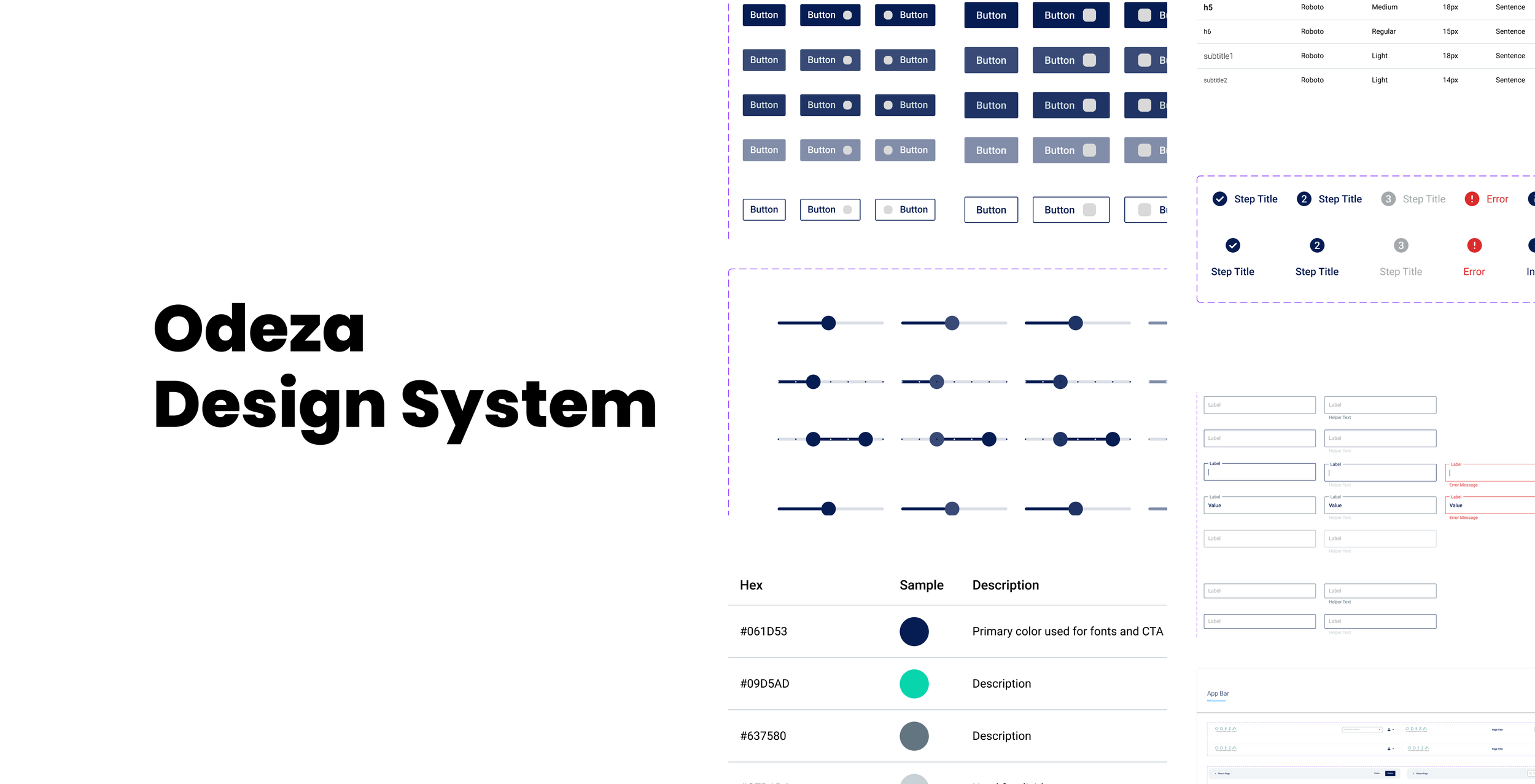
As the main UX/UI designer for Odeza, I was tasked to architect a brand new design system, establishing typography, spacing, and color guidelines as well as leading the transition from a bootstrap to MUI component library. Working side by side with the Director of UX/UI Design, product team, and engineering I established the guidelines that served as the foundation of designing new Odeza products as well as retroactively redesigning already existing products that were initially designed by engineers.
Establishing a System
Foundations
Before this initiative, most of the designs were put together by the engineering team. This was the ideal situation to establish the design system from a primitive level starting from
Typography
Color palette
Spacing conventions (8pt scale)
Radius
Accessibility Considerations: Key considerations were to make sure all colors met WCAG color contrast standards of at least 4.5:1 as well as making sure the font scales were legible even in the smallest of texts such as labels and tooltips.
Component Library Transition

When determining which component library to use as a base, I created a matrix comparing the top contenders to evaluate the level of guidelines/documentation and the range of components each library had as well as the ease of customization to cover the necessary use cases for our suite of products.
After comparisons and discussions with between design, product, and engineering, we landed on two top libraries:
Material Design System
Ant Design System
Both having a robust library with expansive variants as well as extremely detailed documentation and examples both on the design and development front. Ultimately some of the major factors leading us to move forward with Material was the general design aesthetics as well as their dynamic labels on their fields, allowing us to keep the interface less cluttered with labels, especially with our products having input field heavy pages.
Component Library
To support our existing designs and future functionalities, we needed a robust component library with variants covering all use cases
Buttons, Fields, Controls:
Text Fields
Dropdown Menus
Multi-Select
Search Bars
Buttons (w/ and w/o icons)
Checkboxes and Radio Buttons
Toggle Switches
Navigation and Page Layout:
Primary and Secondary Headers
Footer
Sidebar Navigation
Cards
Input and Confirmation Modals
Accordions
Steppers
Status Components:
Progress Bars
Banners
Toast Notifications
Error Banner
Chips
For Each of these components, I created variants to cover all situations including:
States:
Enabled
Hovered
Active
Pressed
Disabled
Error
Classes:
Primary
Secondary
Outlined
Borderless
Joining TeleVox
In late 2023, Odeza was acquired from Ensemble Health Partners to TeleVox under West Technology Group. Being acquired by another SAS company brought exciting opportunities as well as new challenges. By the time of the acquisition, Odeza’s design system and its new design identity has finally been established across the product suite.
The challenges that came with the acquisition:
Continue developing and designing Odeza branded products to deliver on client promises, while simultaneously learning TeleVox’s design system and design guidelines.
Designing new products for TeleVox and adapting to the new communication/handoff styles of TeleVox’s PM and engineering teams.
Transitioning the design of Odeza products to TeleVox’s design system and at times merging certain products
End to End Design
In addition to retroactively designing Odeza and Televox products, I had the opportunity to help ideate and design brand new products, one being our Campaigns tool. This product is a tool that allows users in the hospital system to run promotions and reach out to their desired networks through multiple channels (SMS, Email, Voice).
Starting from stakeholder interviews to whiteboarding sessions with the product manager and engineering team, we had the opportunity to create this entire product from scratch.
The Crossroads
After compiling requirements and creating user flows, we reached two potential directions for the design, a Dashboard or Step by step Accordion. Given the opportunity of working with our stakeholders as well as our implementation/customer success teams, we decided that User Acceptance Testing would be the best course of action to see which format will give the users the experience that they desired.
Making prototypes for both Dashboard and Wizard formats, we performed shadowed UAT’s followed by user interviews.
After the UAT, we got a clear picture of the merits/demerits of both but the majority of the users preferred the intuitiveness and flow of the accordion format.
The Build
Empowered by direction and a few in person whiteboarding sessions with the PM and engineering, we moved forward to higher fidelity mocks and concepts to start creating requirements and stories for the front and backend teams.
Once we got the design, flow, validations in order, the only decision to be made was the template creation process. Consider it’s dependency of the Template Tool, another product in production, we need to weigh the pros and cons of linking to the Template Tool or porting its functionality to the Campaign Tool.
This discussion is still in progress putting in consideration:
What level the MVP needs to be
Overall product timeline
LOE for the engineering team
Allocation of engineering resources in relation to other high priority products